Color Combinations and Contrasts for Insta-Worthy Window Boxes
Window boxes offer an excellent opportunity to express your personality, enhance curb appeal, and create eye-catching, Insta-worthy displays all year round. Yet, the beauty of any window box often comes down to your choice of plant and flower colors. The right color combinations and contrasts can transform even the simplest box into a breathtaking garden vignette. In this comprehensive guide, discover how to craft stunning window box color palettes that demands double-taps and draws admiring glances!

Why Color Matters in Your Window Boxes
An expertly curated window box does more than just showcase pretty flowers--it tells a visual story. The strategic use of color combinations and contrasts brings out vibrancy, evokes emotion, and adds depth to your outdoor decor.
- Psychological Impact: Colors like blue and green evoke calmness, while red and yellow create excitement and warmth.
- Focal Point Creation: Bold contrasts and unexpected combinations turn mundane window boxes into photo-worthy focal points.
- Seasonal Interest: Picking the right palette transforms your display with each change of season, keeping your home's exterior fresh and inviting.
- Architectural Harmony: Smart color selection helps your window box harmonize--or intentionally contrast--with your home's exterior for that truly curated look.
The Basics of Color Theory for Window Box Design
Before diving into specific Insta-worthy window box color schemes, understanding a few color theory fundamentals can greatly enhance your arrangements. Color theory guides how colors interact and influence each other, forming pleasing palettes and attention-grabbing contrasts.
- Complementary Colors: Colors that sit opposite each other on the color wheel (like blue & orange or purple & yellow) create energetic vibrancy when used together.
- Analogous Colors: These are colors next to each other on the color wheel (such as purples, blues, and greens). They produce harmonious, calming blends--perfect for serene window boxes.
- Monochromatic Schemes: Tones, tints, and shades of a single hue deliver a sophisticated, unified look. More dramatic if one bold accent is included.
- Triadic Colors: Three colors evenly spaced around the wheel (like red, yellow, and blue) provide dynamic and energetic contrasts.
Choosing contrasting colors for window boxes based on these principles ensures your arrangement always stands out, whether your home is classic, modern, rustic, or cottage-style.
Top Trending Color Combinations for Insta-Worthy Window Boxes
Let's explore some of the best and most popular color combos designed to make your window boxes social media-ready!
1. Classic White & Green: Understated Elegance
- Best For: Historic homes, crisp white or dark exteriors, minimalists.
- Plants: White petunias, bacopa, trailing ivy, silver dusty miller, boxwood.
- Why It Works: All-green foliage blends provide a restful, fresh backdrop, while pops of crisp white create contrast that's timeless and photogenic.
This classic window box color combination spotlights lush greenery with pristine white blooms for a look that never gets old.
2. Pretty in Pink: Playful, Feminine Color Pop
- Best For: Cottages, shabby chic styles, romantic homes.
- Plants: Pink geraniums, trailing petunias, sweet alyssum, pink calibrachoa.
- Why It Works: Shades of blush, bubblegum, and magenta grouped together create a playful, feminine vibe with visual texture.
*Accent with chartreuse grasses or dark purple foliage for compelling contrast.
3. Fiery Warm Tones: Red, Orange, and Yellow
- Best For: Urban settings, homes with brick or stone facades, bold personalities.
- Plants: Red begonias, orange marigolds, yellow nasturtiums, gold lantana.
- Why It Works: These warm color combinations for window boxes evoke sunshine and summer, instantly grabbing attention and brightening up neutral exteriors.
Use trailing foliage or variegated greens to balance the intensity.
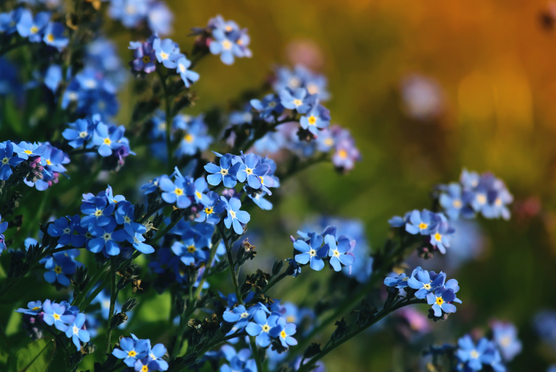
4. Cool and Calm: Shades of Blue and Purple
- Best For: Seaside cottages, modern homes, tranquil garden styles.
- Plants: Blue lobelia, purple verbena, lavender, ageratum, trailing bacopa.
- Why It Works: Blue and purple create a calming effect. Their cool synergy delivers Insta-worthy sophistication with every angle.
*Pair with silvery dusty miller or white alyssum for extra depth.
5. Vibrant Contrasts: Purple & Yellow for Bold Impact
- Best For: Modern homes, bold designers, lovers of energetic displays.
- Plants: Bright yellow pansies, purple calibrachoa, gold marigolds, deep purple petunias.
- Why It Works: As complementary colors, purple and yellow create electric contrast that's pure visual drama--perfect for grabbing attention on your feed!
6. Fresh and Fruity: Orange, Lime, and Fuchsia
- Best For: Eclectic spaces, patios, party-ready window boxes.
- Plants: Lime coleus, bright fuchsia petunias, orange million bells, trailing golden creeping Jenny.
- Why It Works: Fresh color pairings inspired by tropical fruits make any window box pop--add a sunny backdrop for maximal effect.
These lively color combinations keep your window boxes vivid and "snap-worthy" throughout the growing season.
7. Monochromatic Drama: One Color, Many Shades
- Best For: Sophisticated facades, urban homes, modernists.
- Plants: Choose one base color (e.g., purple) and layer light and dark tones: lavender, pale blue, deep purple petunia, almost-black foliage.
- Why It Works: Depth and interest come from textural plays and subtle shifts in shade--resulting in understated, elegant window box color schemes.
How to Create Contrast for Eye-Catching Window Boxes
While complementary and monochromatic color schemes are visually appealing, creating visual contrast takes your design to the next level:
- Dark vs. Light: Blend pale blooms with deep foliage (e.g., white impatiens with burgundy heuchera).
- Saturated vs. Soft: Pair intense primaries (like hot pink) with soft pastel accents for a dimensional effect.
- Leaf Texture: Use textural contrasts--spikey grasses with broad-leafed annuals, or velvety versus glossy leaves--to break up color blocks.
- Trailing vs. Upright: Mix upright spikes (like salvia) with cascades (like lobelia) to add motion and drama.
- Surprise Accents: A single ornamental pepper or ornamental kale can add an unexpected pop of bold color.
Paying attention to contrasts in window box color schemes ensures your display is always photo-ready and never flat or boring.
Matching Window Boxes to Home Exteriors
An Insta-worthy window box should always have a relationship with the color of your home's facade, trims, and even surrounding landscape. Consider these strategies:
- Harmonize: Select hues that repeat existing architectural or garden colors for a seamless look.
- Contrast: Go bold with opposites--think hot reds and pinks on gray or navy exteriors, or cool blues and greens on warm, tan brickwork.
- Frame the Window: Use neutrals (white, silver, green) close to the window, and brighter colors outward for a natural frame effect in photographs.
- Consider Window Box Color: Black or iron boxes can handle intense color; whitewash containers look best with pastels or greenery.
- Climate and Light: Pale palettes for hot, sunny walls; warm colors to brighten shady exteriors.
Always step back and evaluate your color palette in both natural and artificial light--color perception changes dramatically based on weather, time of day, and camera filters.
Four-Season Color Tips for Ultimate Curb Appeal
Want your window box flower combinations to stay lovely and camera-ready throughout the year? Plan for seasonal transitions:
Spring Window Box Color Combinations
- Pastel tulips, daffodils, and iris
- Bright trailing lobelia or pansies
- Fresh parsley and herbs as green fillers
Summer Spectacle: Go Bold!
- *Petunias, verbena, geraniums in saturated pinks, reds, purples
- Trailing sweet potato vine or creeping Jenny
- Silver foliage for a cooling effect
Autumn Combinations: Harvest Hues
- Mums and aster in gold, rust, and purple
- Ornamental kale and peppers for long-lasting color
- Mini pumpkins and gourds for festive flair
Winter Window Box Contrasts
- Evergreens, pinecones, berried branches
- White twigs, silver balls, or red bows for color and texture
- Contrasting foliage (boxwood, holly, cypress)
Expert Tips for Insta-Worthy Window Boxes
- Follow the "Thriller, Filler, Spiller" Rule: Choose one upright statement plant, a few bushy fillers, and trailing elements that spill over the sides--a tried and true designer trick!
- Repeat Accent Colors: Echo accents from your front door, planters, or shutters for cohesion and visual continuity on camera.
- Group Odd Numbers: Use odd numbers of plants for natural, balanced arrangements (3, 5, or 7 of each type).
- Play with Leaf Color: Mix chartreuse, silver, burgundy, or variegated foliage for interest even when flowers are sparse.
- Regular Refresh: Deadhead blooms, replace tired annuals, and clean up regularly to keep every shot "post-ready."
DIY Example: Insta-Ready Summer Window Box
Here's one simple, universally appealing color recipe guaranteed to capture attention:
- Window Box: Matte black wrought iron container
- "Thriller": Bright red geranium (upright, attention-grabber)
- "Filler": Purple verbena and white petunia (texture + volume)
- "Spiller": Chartreuse creeping Jenny and vibrant blue lobelia (contrast and trailing charm)
After planting, snap pics at "golden hour" to highlight those bold color contrasts in your window box arrangement and enjoy the hearts rolling in!
Frequently Asked Questions: Color Combos for Window Boxes
What are the best low-maintenance color combinations for window boxes?
Go for drought-tolerant hues like blue salvia, yellow marigold, and trailing ivy for stunning color with minimal upkeep. Pair monochromatic greens with pops of white for easy elegance.
How can I make small window boxes look more dramatic?
Use high-contrast color pairings such as yellow and purple or red and white, and emphasize vertical growth with spiky "thriller" plants.
Can I use foliage-only combinations? Will they still look Instagrammable?
Definitely! All-foliage window boxes with a mix of chartreuse, burgundy, silver, and dark green plants deliver chic, textural interest year-round and photograph beautifully--especially when paired with the right container color.
Conclusion: Your Insta-Worthy Window Box Awaits
Color is the secret ingredient to making your window boxes stand out and go viral. Experiment with the boldest hues, freshest contrasts, and creative combinations to reflect your style and suit your architecture. Whether you choose soothing monochromes, complementary burst, or eco-chic foliage displays, your home's windows can become a vibrant stage for flower artistry.
So go ahead--try these color combinations and contrasts for window boxes and turn every passerby (and Instagram follower) into a fan!